It was once famously said
“Prettiness, that’s what’s important. Followed by Navigation then content.”
… OK maybe not that famous but it was said, and it was in response to the question: Which is more important content or navigation? The response in it’s own right has it’s points. People will argue that a site like Google isn’t very pretty, nor is Amazon. What they do offer is function and service, but I would actually argue that Google is full of “prettiness”. Google may not be pretty everyday but she certainly does like to dress up every now and than as seen on the Holiday Logos archive, and there is something else, Google has a certain kind of symmetry.
Are We Really That Shallow?
looks and aesthetics really do matter, how something looks is going to invoke an initial reaction and on the web that reaction could cost you traffic.
“This ratio appears everywhere in nature, you may not be aware of it but it’s there everyday of your life.”
If your site doesn’t come off as visually appealing to whomever surfs to it. If it hurts their brain to look at it then there is a chance they will leave before even getting to your content. Apple has built a brand around aesthetics, clothes and shoe brands are built around how they look (or make YOU look); even that photo of the hamburger at McDonalds was taken in the best light and aligned just right (there really is such a thing as a good side).
If your site doesn’t look good, if it is hard on the eyes. It is going to be hard for people to love an ugly site. That’s not to say that your site has to be one of those avant-garde new age sites that has experimental navigation that nobody can decipher. It just means your site shouldn’t be the gawky weird one if you want a large group of people to give it a chance.
1.61803399 Is the Most Important Number
There are a few basic rules when it comes to design one of those rules is referred to as the golden ratio, expressed as 1.61803399 also know as the Fibonacci sequence. It’s basically what has been determined as the most common ratio of everything around us in nature, the universe, and the meaning of life… it’s pretty much everywhere. It has been studied for centuries but what does it mean? This ratio appears everywhere in nature, you may not be aware of it but it’s there everyday of your life. Your brain has been trained to process it naturally and identify it as pleasing. If your brain sees this pattern in nature as pleasing then it makes sense it would process something man made with this same design principles in mind … say for example your website. Da Vinci was known for applying this rule to his artwork so I think it’s safe to say if it was good enough for him it’s probably good enough for you.
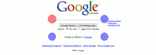
To make things a bit easier there is a simplified version of the Fibonacci sequence called the rule of thirds, almost any first year high school art class will teach you about the rule of thirds. The basic idea is that your center of attention should fall into one of four quadrants. In the image bellow there are 4 blue dots, where those dots are is where your element of primary attention should fall.

Ideally you would only want to have one element as your center of attention, your other elements should fall into the rest of the natural checkerboard. It is probably because of the rule of thirds and the Fibonacci sequence that websites are typically designed this way today. Most blog themes go for a 2/3 content split and 1/3 navigation split. This site was intentionally designed to have the core body content set to 960 pixels because 960 is easily divisible by many numbers including into thirds.
This pattern can be taken even further to be repeated through out your site. Have an image? Applying the rule of thirds makes sure the primary message of the image is drawn out, by placing it in one of the key quadrants. Even better and something I plan on adding to my site, have a comment you want to stand out? Repeat it inline with your article but align it to one third of your content space. Magazines often use this trick to pull you into an article highlighting a quote on a page in bold about one third down and one third to the left or right.
It’s Not All Math But it Kind of is…
Yes there are other components to design, things like negative space, positive space, color, contrast, and pattern but the one thing that doesn’t seem to change from site to site is the rule of thirds or the golden ratio. On the Google home page the search box aligns to the top left quadrant of the rule of thirds or where the red dot is in the following image.

everything else may be subjective, but there are few cases where a popular site doesn’t obey the rule of thirds. They may be styled with the web 2.0 sheen, or conversely look really grungy but ultimately either the rule of thirds is being applied or the golden ratio. If you want one design rule to follow to make your site look good it should be that rule, it will help people adjust to the rest of your site design more naturally. Once people have appreciated the “prettiness” of your site they will notice the next most important thing content or navigation … because it’s true the pretty ones do finish first at least online.

Leave a Reply